Analogue: China
We first looked at the Covid-19 stats in China to see how the lockdown worked in slowing the rate of infection and how long the lockdown lasted. China put itself on lockdown on the 23 January 2020. Exactly 14 days later, the number of new Covid-19 infections started to fall. 64 days later from the lockdown date, China has now begun to lift its restrictions. 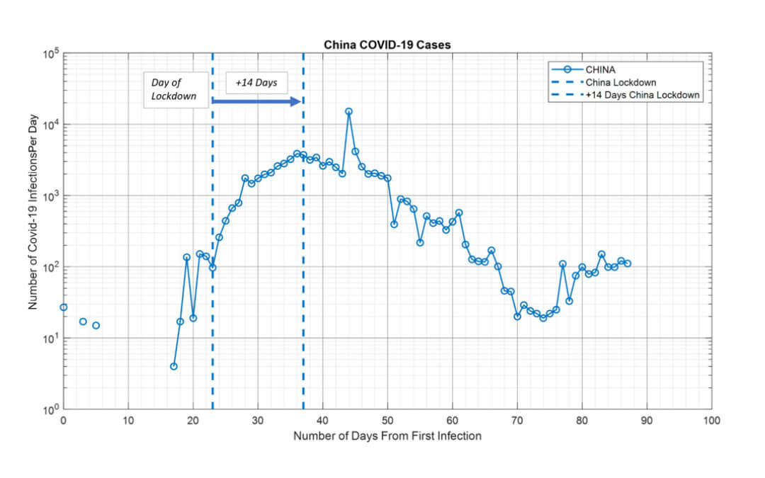
Test Prediction: Italy
Italy is the next most affected country to date. It imposed a lockdown on 09 March 2020 which is now over 14 days. We compared Italy to China to see if we could find similarities in the rate of infections and how lockdown has impacted Covid-19’s spread. As can be seen in the chart below, Italy has followed the same course as China during its lockdown, with the rate of infections increasing over the first week of the lockdown (due to already infected developing symptoms) but then slowing down over the next course of the week as the rate of infection spread slowing down (containment phase). We believe Italy peaked on 24 March 2020 when it reached total infections of ~70,000. We believe Italy now is on a downward trajectory in its rate of infection per day. We should see the number of cases plateauing and further decreasing over the coming weeks, provided it adheres to its current lockdown restrictions. If it manages its current course, around early/mid-May (12 May 2020 if it follows China’s 64 days later strategy) should be in a position to ease its lockdown. 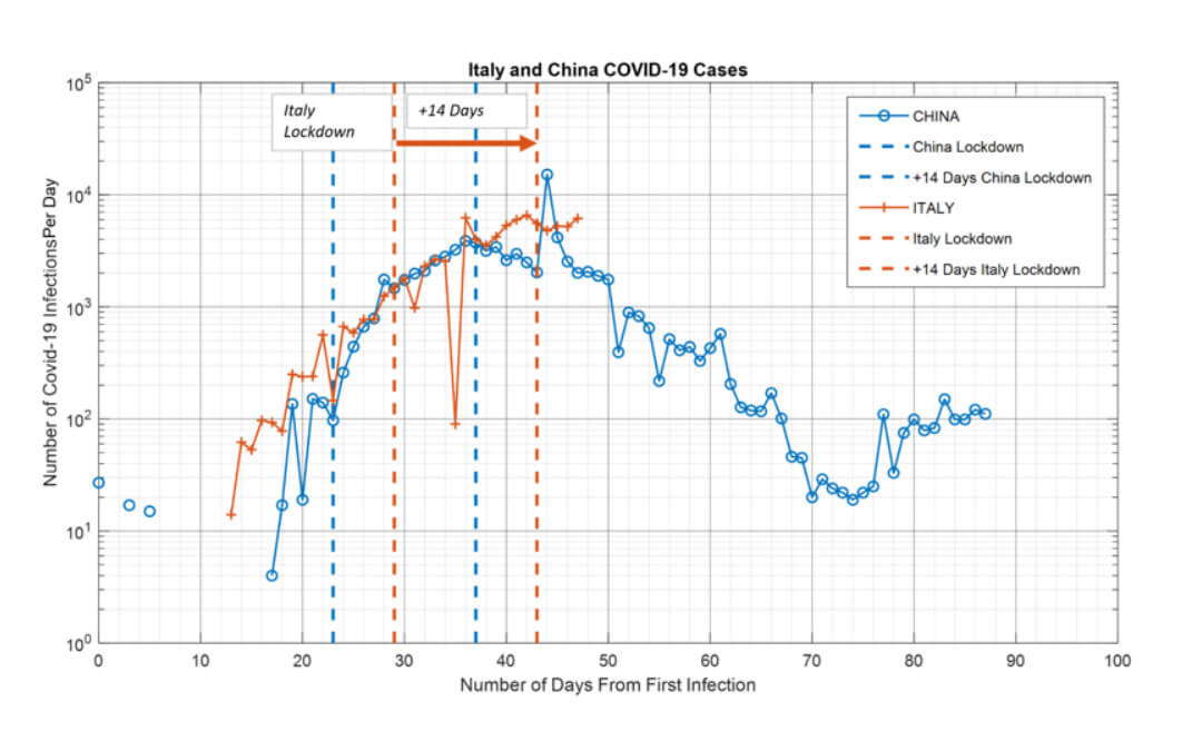
Forecast: United Kingdom
The UK imposed its lockdown on 24 March 2020. Based on our model, which succeeds to predict Italy’s stats very well, we believe the UK will peak in 14 days from the date of its lockdown i.e. around 07 April 2020. The UK will continue at its current rate of infection, with slowing down and plateauing around 07 April 2020. Our model predicts the total number of infections to be ~46,000 in an optimistic scenario and ~63,000 in a most probable scenario. The reality will truly depend on how effectively the UK’s population continues to honour the lockdown. If it follows the Italy rate of increase, which is highly probable, infections will peak to a total of ~63,000 before the UK starts to see a decline in its daily infection rate. And 64 days later, i.e. 28 May 2020, we should hopefully see the UK begins to ease it’s lockdown restrictions. 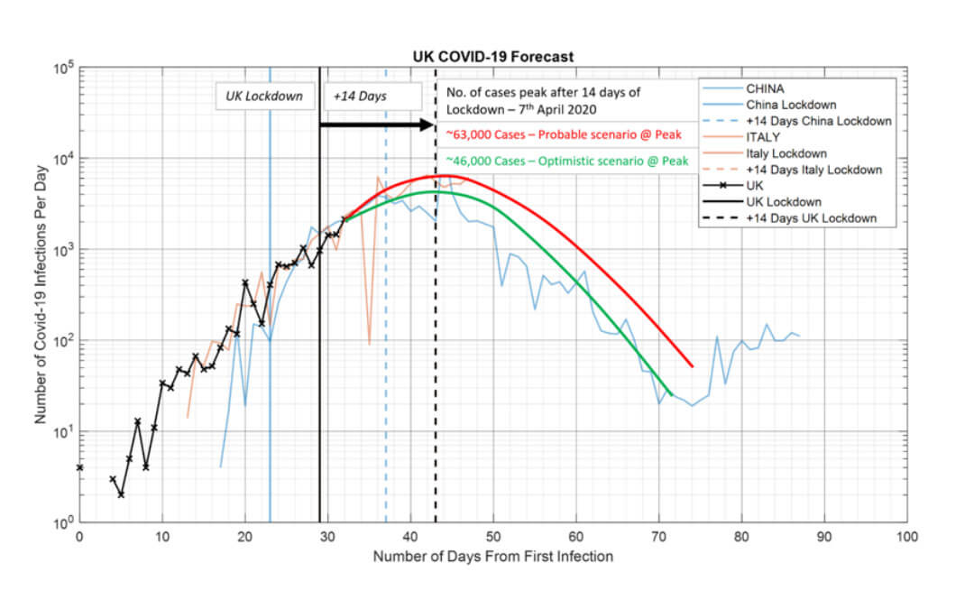
What about the others:
We also looked at France, Germany, Spain and the US, given they are currently in the list of the top 10 countries on Covid-19 infections, just to see how well we can predict what happens (or is happening) there. France imposed its lockdown on 17 March 2020 and seems to be following the same trajectory as China, Italy and the UK in terms of its rate of infections. We expect France to remove its lockdown around 20 May 2020. Germany has yet to impose strict lockdowns (as far as we can see), and perhaps consequently continues to see a higher rate of increase in daily infections than France, Italy and the UK. Spain seems to be an anomaly; despite having its restrictions in place since 15 March 2020, it seems to be experiencing a high rate of increase in daily infections than France, Italy, China and the UK. We wonder why this is so, despite the European countries compared having largely similar age demographics to each other. The US has not really implemented a lockdown from what we understand. It has only implemented social distancing, and the impacts of this can be seen in the stats.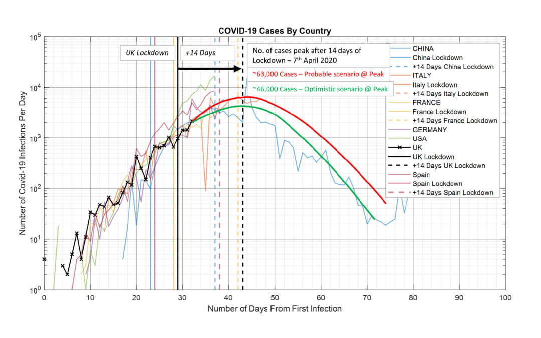
Now, the next interesting question is why is the death rate so high in Italy versus any other country, despite the age demographics being similar across all European countries. Experts say this is because of the higher levels of co-inhabiting of young and old in families than other countries. Nonetheless, it will be interesting to see how a similar predictive model can show peak death rates expected across these countries. And further analysis into demographics to see if this can be explained.
Death rate predictive analysis to follow …
www.finreg-e.com
References and notes:
The charts show the daily increase in Covid-19 infections per day since day O, i.e. the day when the first infections were recorded by the countries included in the analysis.
1) https://www.worldometers.info/coronavirus/
2) https://en.wikipedia.org/wiki/List_of_countries_by_age_structure
3) https://ourworldindata.org/coronavirus
4) https://www.who.int/emergencies/diseases/novel-coronavirus-2019
5) https://www.gov.uk/coronavirus